Sign Up process complicated
Mobile website did not scale
Sign Up process complicated
Sign Up process complicated
Mobile website did not scale
Navigation was difficult
Navigation was difficult
Navigation was difficult
Click Save Website redesign
Click Save Website redesign
Project duration: 6 Weeks
Project starting 1/12/21 - 12/02/22
Project starting 1/12/21 - 12/02/22

The product: Clicksave - online savings bank
Clicksave is an online savings bank that allows customers to add a personal saving goal and save by setting up affordapaymentsble monthly .
Clicksave is an online savings bank that allows customers to add a personal saving goal and save by setting up affordapaymentsble monthly .
The product: Clicksave - online savings bank
Clicksave is an online savings bank that allows customers to add a personal saving goal and save by setting up affordapaymentsble monthly .
The problem:
The previous website currently has a large drop off of users at the onboarding stage. Users also found the transactions screen hard to understand
.
The previous website currently has a large drop off of users at the onboarding stage. Users also found the transactions screen hard to understand
.
The goal:
Create a new onboarding flow that simplified account set up, we were also tasked with updating the transactions screen making it easier for the user to navigate
Create a new onboarding flow that simplified account set up, we were also tasked with updating the transactions screen making it easier for the user to navigate
The goal:
Create a new onboarding flow that simplified account set up, we were also tasked with updating the transactions screen making it easier for the user to navigate
User research: summary
We bagan the user research by firstly conducting user interviews so we could understand the pain points the user experienced while using the product, from which we could go about creating 2 different personas
During the research phase of project we also conducted remote usability studies, during which we gave the participants various prompts in which to complete different tasks. We collected various data that gave us a starting point on how to improve the overall user experience.
During the research phase of project we also conducted remote usability studies, during which we gave the participants various prompts in which to complete different tasks. We collected various data that gave us a starting point on how to improve the overall user experience.
Transaction page missing info
User Pain Points
The onboarding overfaced the user with info. The current process has on long form which was hard to navigate and check input.
The current mobile webpage was missing some basic information and was usable for the users needs
Information such as transaction details and dates were missing. Its also hard for the user to filter through details.
Navigation throught the website was difficult and gave the user too many options which could have been simplified.
Creating User Personas
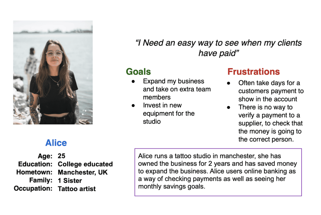
From the study user interviews we carried out we then created 2 user personas to help identify 2 differnt types of user
Problem statement:
Alice is a Tattoo artist
who needs to be able to save money to invest in her business
because she grown out of her current space.
Alice is a Tattoo artist
who needs to be able to save money to invest in her business
because she grown out of her current space.
The goals we outlined for the project were :
1: Create an efficient way for the user to add funds and track there transactions.
2:We also wanted to make the onboarding process more efficient.
1: Create an efficient way for the user to add funds and track there transactions.
2:We also wanted to make the onboarding process more efficient.
User Journey Map

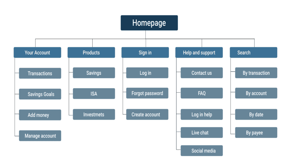
Sitemap
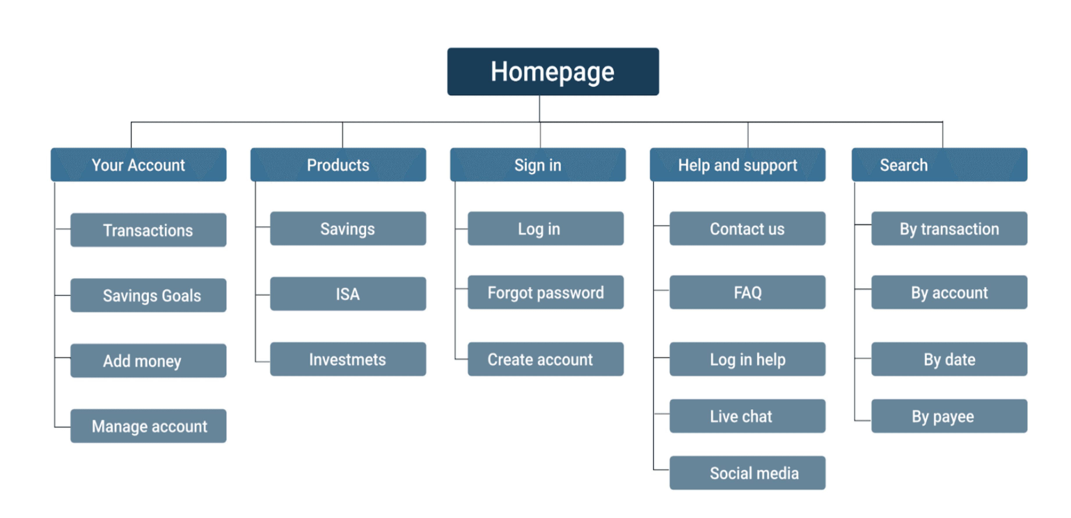
Creating a sitemap gives us an understanding of the layout and navigation of the website


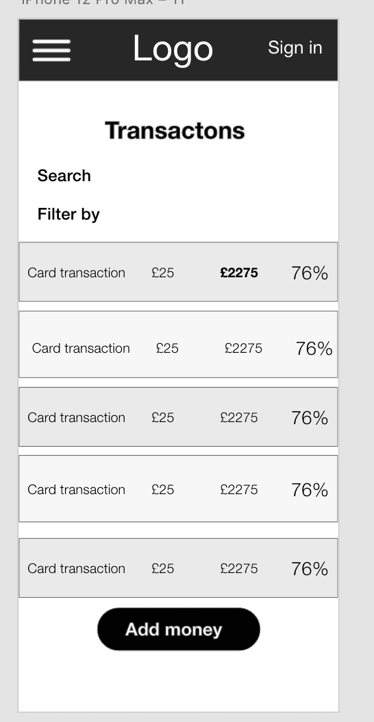
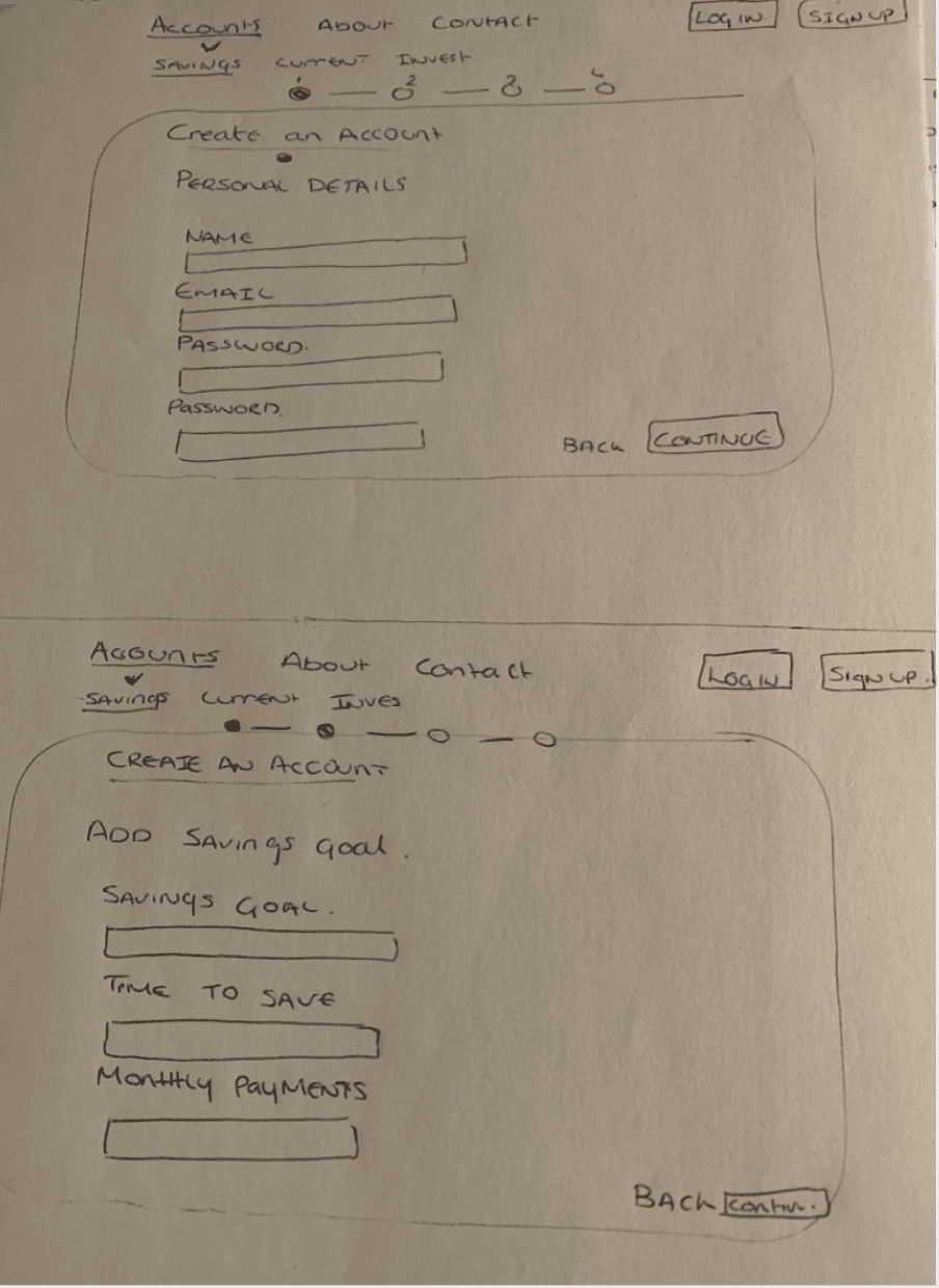
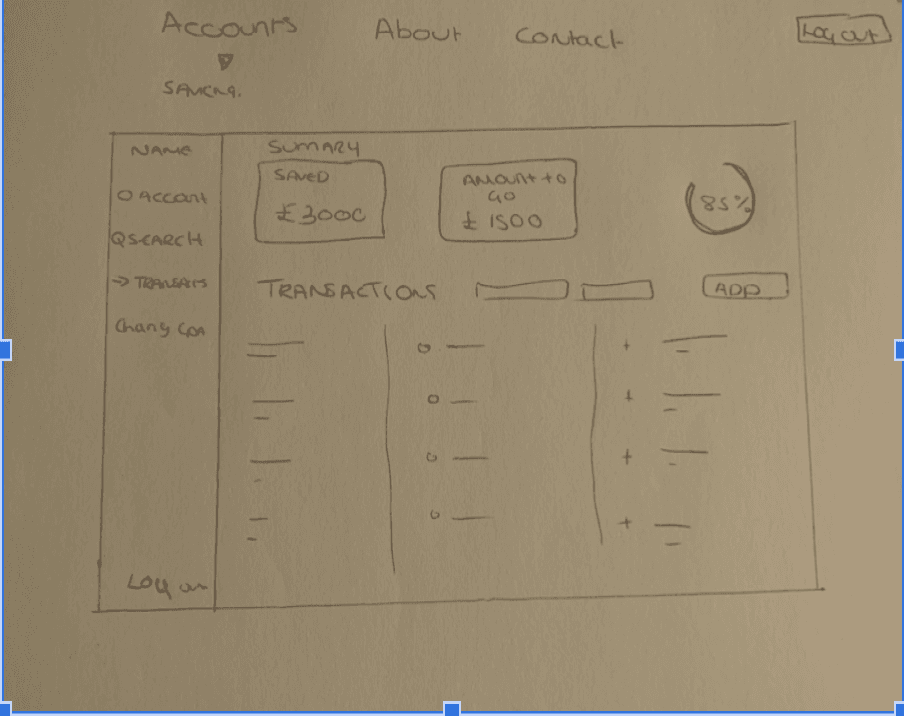
Paper wireframes
Here we have 2 early paper wireframes, One to outline the onboarding flow and the other shows the transactions screen
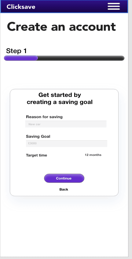
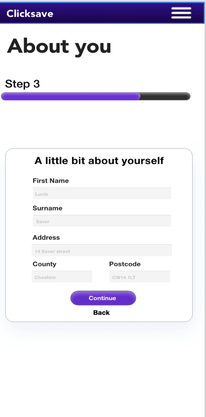
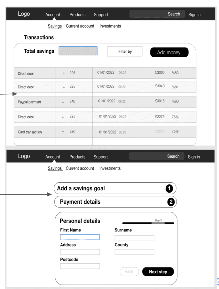
Digital wireframes
Digital wireframes
We added transaction detail including payment methods, date , and the percentage of the savings goal the user had already reached.
For the updated onboarding flow we decided to split the information needed up into multiple collapsing slides. This would ensurte the user wasn't overwhelmed by the information needed to create an account


We replicated both the redesign of the transaction screen and the new onboarding process for mobile. We paid attention to the layout of the Desktop site in order to ensure consistency throught the screen sizes.
We replicated both the redesign of the transaction screen and the new onboarding process for mobile. We paid attention to the layout of the Desktop site in order to ensure consistency throught the screen sizes.
Digital wireframe
screen size variation(s)
screen size variation(s)
Digital wireframe
screen size variation(s)
screen size variation(s)
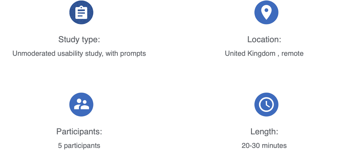
Usability study: parameters
1
2
3
Usability study: Findings
We collected data from the usability study and selected 3 of the key findings.
The sign up flow needed an the addition of screen number and titles so the user could easily navigate
In the transactions section the user would like a way to distinguish between debit card transactions and direct debit payments.
We also discovered that the addition of a “ADD MONEY’ cta button on the transactions page would be helpful to the user.
Mockups
Following on from the findings of the usability study we added a button to add money to the account as well as highlighting the different kinds of transactions


Before
After
After
Desktop


Mobile

We will conduct a first week user review study where we will ask users for feedback on the new design.
6 week kpi review: After the first six weeks of the new site being live we will collect data on how the redesign has affected the customer sign up totals.
Impact:
We did a 6 week review of the website and impact the redesign had mainly on new user sign up. Click save saw a 28 percent increase in user sign ups over the review period. We also saw a 48 percent increase in users using the redesigned mobile site.
We did a 6 week review of the website and impact the redesign had mainly on new user sign up. Click save saw a 28 percent increase in user sign ups over the review period. We also saw a 48 percent increase in users using the redesigned mobile site.
We will review the number of new and returning customers that chose to
use the mobile web site
use the mobile web site
Moving forward and handover
Project reflections
1
2
2
3
Thank you for your time.
Lets connect
joshwilkes.mail@gmail.com
Lets connect
joshwilkes.mail@gmail.com
W o r k
A B O U T
W o r k
A B O U T
The product: Clicksave - online savings bank
Clicksave is an online savings bank that allows customers to add a personal saving goal and save by setting up affordable monthly payments.
Clicksave is an online savings bank that allows customers to add a personal saving goal and save by setting up affordable monthly payments.
Project duration: 6 Weeks
Project starting 1/12/21 - 12/02/22
Project starting 1/12/21 - 12/02/22
Lead UX/UI Designer


The goal:
Create a new onboarding flow that simplified account set up, we were also tasked with updating the transactions screen making it easier for the user to navigate
Create a new onboarding flow that simplified account set up, we were also tasked with updating the transactions screen making it easier for the user to navigate

User research: summary
The problem:
The previous website currently has a large drop off of users at the onboarding stage. Users also found the transactions screen hard to understand
The previous website currently has a large drop off of users at the onboarding stage. Users also found the transactions screen hard to understand
We bagan the user research by firstly conducting user interviews so we could understand the pain points the user experienced while using the product, from which we could go about creating 2 different personas
During the research phase of project we also conducted remote usability studies, during which we gave the participants various prompts in which to complete different tasks. We collected various data that gave us a starting point on how to improve the overall user experience.
During the research phase of project we also conducted remote usability studies, during which we gave the participants various prompts in which to complete different tasks. We collected various data that gave us a starting point on how to improve the overall user experience.
User Pain Points
The current mobile webpage was missing some basic information and was usable for the users needs
Mobile website did not scale
Navigation was difficult
Navigation was difficult
Navigation throught the website was difficult and gave the user too many options which could have been simplified.
Creating User Personas
From the study user interviews we carried out we then created 2 user personas to help identify 2 differnt types of user
Information such as transaction details and dates were missing. Its also hard for the user to filter through details.
Transaction page missing info
Transaction page missing info
Alice is a Tattoo artist
who needs to be able to save money to invest in her business
because she grown out of her current space.
Problem Statement
User Journey Map
The goals we outlined for the project were :
1: Create an efficient way for the user to add funds and track there transactions.
2:We also wanted to make the onboarding process more efficient.
1: Create an efficient way for the user to add funds and track there transactions.
2:We also wanted to make the onboarding process more efficient.
Paper wireframes
Here we have 2 early paper wireframes, One to outline the onboarding flow and the other shows the transactions screen
Digital wireframes
We will conduct a first week user review study where we will ask users for feedback on the new design.
We added transaction detail including payment methods, date , and the percentage of the savings goal the user had already reached.
Digital wireframes screen size variation
We replicated both the redesign of the transaction screen and the new onboarding process for mobile. We paid attention to the layout of the Desktop site in order to ensure consistency throught the screen sizes.
Usability study: parameters


Usability study: Findings
We collected data from the usability study and selected 3 of the key findings.
1
2
3
The sign up flow needed an the addition of screen number and titles so the user could easily navigate
In the transactions section the user would like a way to distinguish between debit card transactions and direct debit payments.
We also discovered that the addition of a “ADD MONEY’ cta button on the transactions page would be helpful to the user.
Mockups
Following on from the findings of the usability study we added a button to add money to the account as well as highlighting the different kinds of transactions
Before
After
Desktop
Mobile
Moving forward with the build
6 week kpi review: After the first six weeks of the new site being live we will collect data on how the redesign has affected the customer sign up totals.
We will review the number of new and returning customers that chose to
use the mobile web site
use the mobile web site
1
2
3
Impact:
We did a 6 week review of the website and impact the redesign had mainly on new user sign up. Click save saw a 28 percent increase in user sign ups over the review period. We also saw a 48 percent increase in users using the redesigned mobile site.
Thank you for your time.
Lets connect
joshwilkes.mail@gmail.com
Project reflections
W o r k
A B O U T