HELPOUT FOOD BANK
WEB/APP DESIGN
WEB/APP DESIGN
The product: Help Out - Uk Food Bank Network
Helpout is a charitable organisation the supports over
Half a million families in the uk on low income, by
Providing food and essentials.
Helpout is a charitable organisation the supports over
Half a million families in the uk on low income, by
Providing food and essentials.
Project duration: 6 weeks
02/02/22 - 16/03/22
02/02/22 - 16/03/22
The Problem
Users need a way to book collections and essentials
Online. Many users are on low income and don’t have access to a desktop device so designing for all screen sizes is needed.
Users need a way to book collections and essentials
Online. Many users are on low income and don’t have access to a desktop device so designing for all screen sizes is needed.
The goal
To create a responsive website and dedicated mobile app that would allow users to book collection of essentials, find the closest food bank and make online donations
To create a responsive website and dedicated mobile app that would allow users to book collection of essentials, find the closest food bank and make online donations
Before starting the design process we conducted some initial user research this research
Included studying the design of similar charities and how they handled the booking process.
We then conducted user research by contacting users and asking them to complete a questionnaire.
The users we asked to answer questions were of varying ages from 18-50 that already used the food banks. A split between users on low income and those that would be looking to make donations to the charity were asked to complete the questionnaire .

User Research
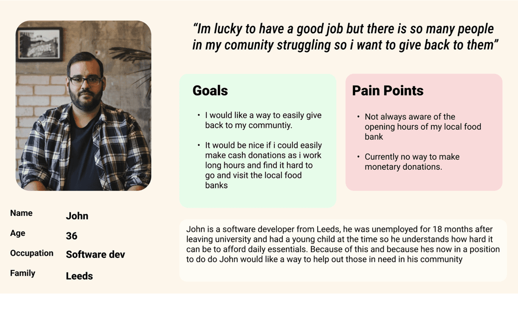
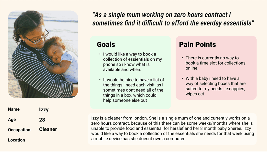
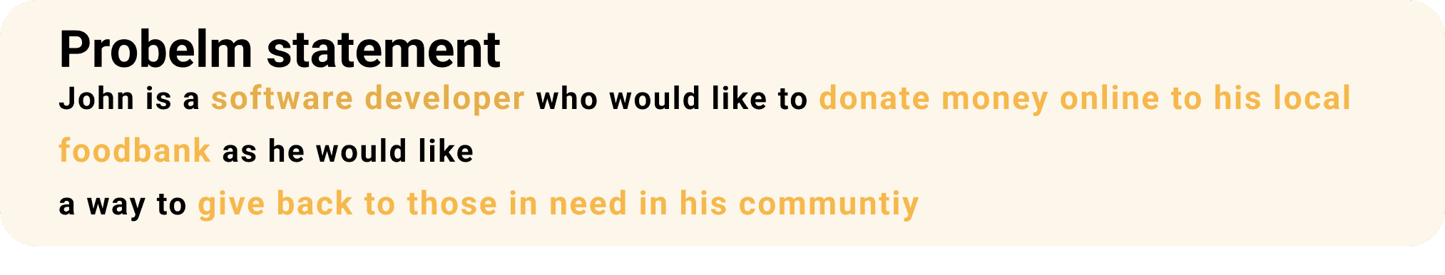
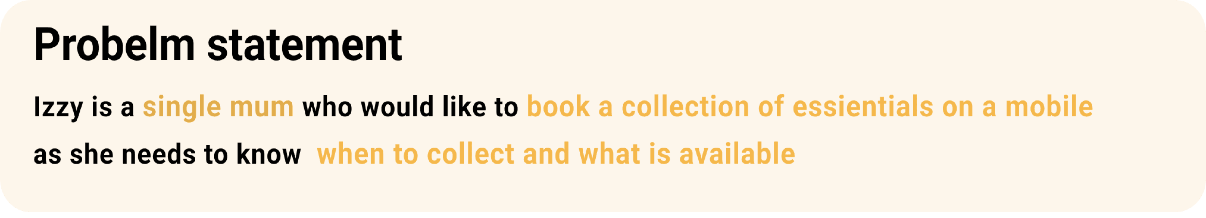
User Personas
Initial design steps
Paper Wireframes and crazy eights
Paper Wireframes and crazy eights
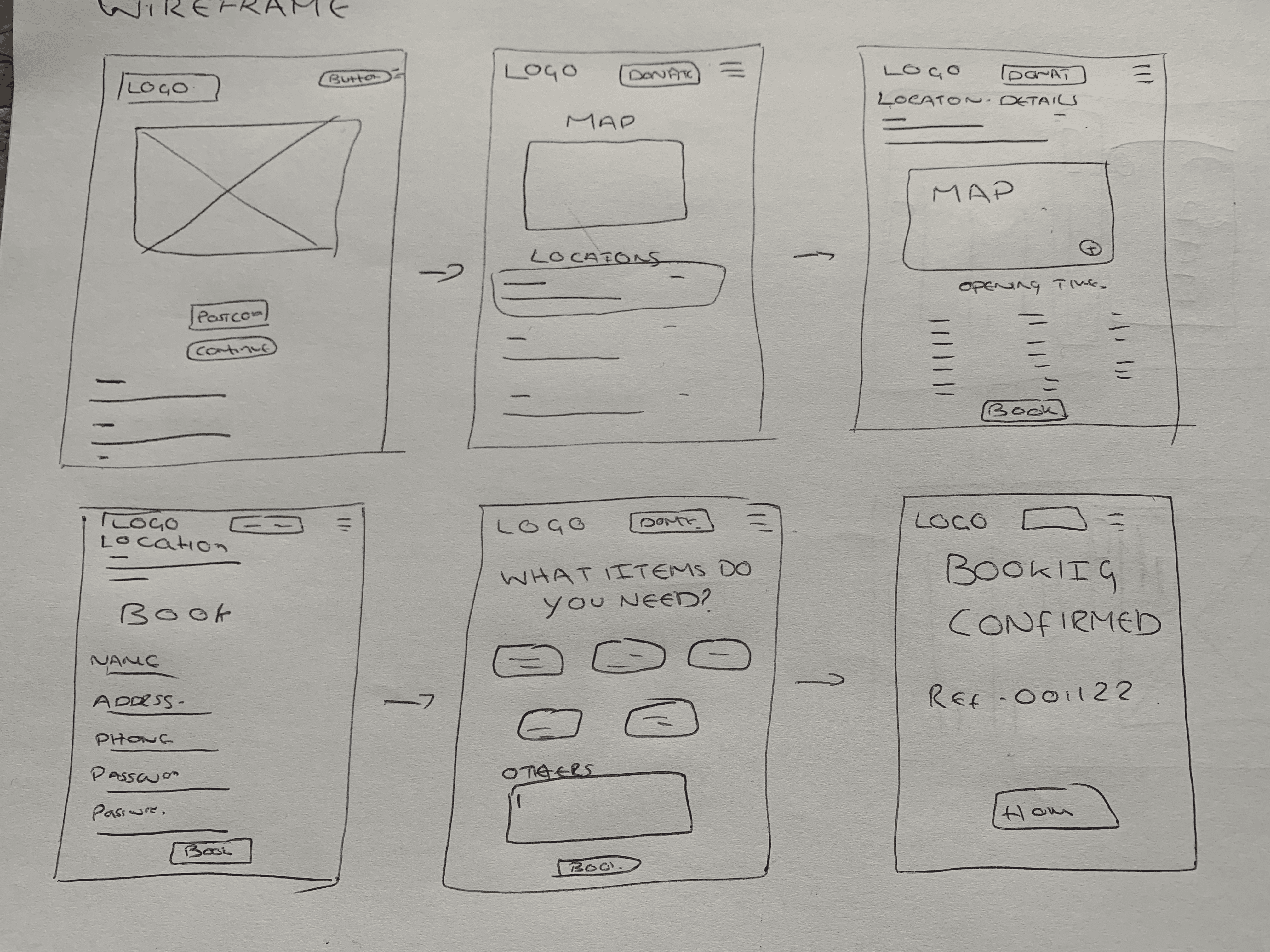
Paper Wireframes
Once we had an idea how each screen of the design should look we began to create paper wireframes of each screen and made a quick example of the user flow. Using this method is quick and efficient and allows us to make iterations without investing too much time into each iteration
Once we had an idea how each screen of the design should look we began to create paper wireframes of each screen and made a quick example of the user flow. Using this method is quick and efficient and allows us to make iterations without investing too much time into each iteration
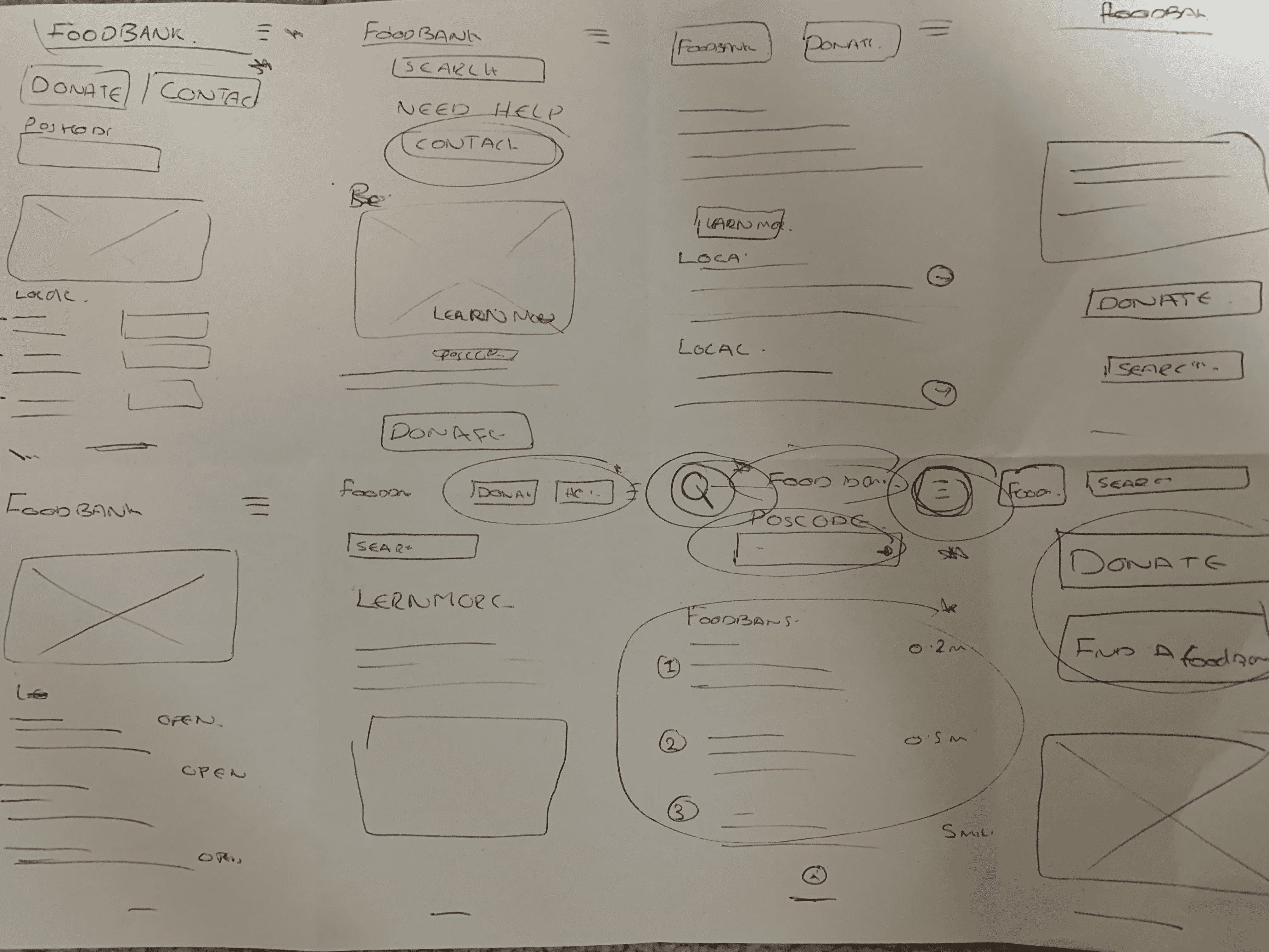
Crazy Eights
We conducted a crazy eights exercise to get some ideas of what the final homepage could look like. From the exercise many of the layout ideas made it to the final design
We conducted a crazy eights exercise to get some ideas of what the final homepage could look like. From the exercise many of the layout ideas made it to the final design
Digital Wireframes


Creating Prototypes to test
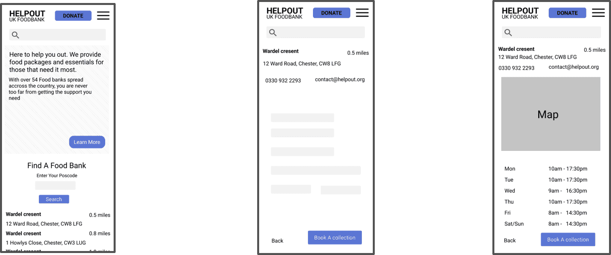
Address
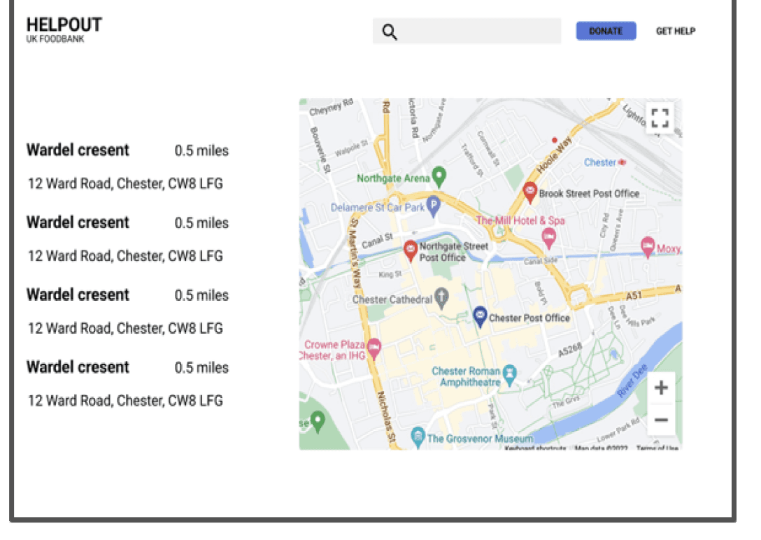
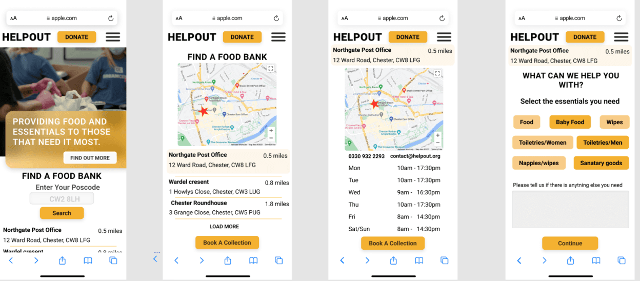
Throughout the booking process the address of the foodbank is visible, and in the final steps a Map is added to give the user a visual cue of the food bank they are booking a collection from.
Throughout the booking process the address of the foodbank is visible, and in the final steps a Map is added to give the user a visual cue of the food bank they are booking a collection from.
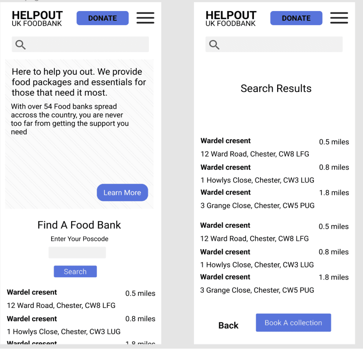
Donate button.
We decided on having a donate button that would stick at the top of the screen to allow a quick donation option
We decided on having a donate button that would stick at the top of the screen to allow a quick donation option
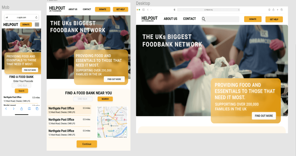
Once we had a good understanding of how we wanted the design to look we then began to create digital wireframes that would give us a more accurate idea of how the design would look on each device and screen size
We create digital wireframes for each screen size. Here is an example of the desktop site, we made sure that the site looked visually consistent across the screen sizes and scaled up elements from the mobile site.

Once we had created the wireframes for each screen we then used Figma to link each screen and create a low fidelity prototype that we could test with the users in a usability study
Each user was sent the link to the prototype and asked to complete the booking of a collection from a food bank

Mapping the user journey
We compiled a user journey map to get a good understanding of how the user would interact with the product.

Identify User Pain Points
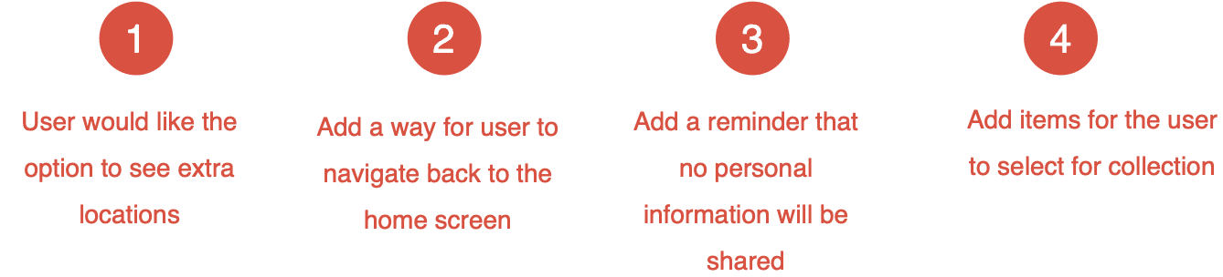
4 OUT OF 1O users identified that it would be useful to have the option to select from a larger list of locations.
6 out of the 10 users identified that there was no easy way to navigate back to the home screen once a booking was confirmed
Some users felt unsure about adding personal information to the account creation form so adding a reminder that information is secure would be helpful
3 of the users said it would be useful to have quick select items to add to an order.
Sitemap
We created a sitemap to show the navigation flow of the site

Mock ups showing the final look of the design
Mockups of the Final Design


Once we have created designs for all the screens we then used the prototype tool in Figma to add interactions this would allow us to create a working prototype to further test with the users
Creating High Fidelity Prototypes

During the final round of user testing we identified various pain points in the design. Here is an example of one of these pain points.
4 out of the 10 users that tested the prototype identified that the goods section screen was slow and could be simplified with a list of goods. We decided to add options to select the most commonly ordered goods making the flow quicker and more efficient for the user
4 out of the 10 users that tested the prototype identified that the goods section screen was slow and could be simplified with a list of goods. We decided to add options to select the most commonly ordered goods making the flow quicker and more efficient for the user
High fidelity prototype user testing

BEFORE
AFTER
W o r k
A B O U T

Once all the designs have been completed and specs have been added the design will be ready to had off to the developers
I will work closely with the developers to ensure a seamless build and help with any changes needed to the design
Once the site is launched we will then go back and look at how well the site is performing and use KPIs to determine any changes needed
Final Steps
Thanks for taking the time to read through the my case study.
For any information don’t hesitate to to contact me
joshwilkes.mail@gmail.com
For any information don’t hesitate to to contact me
joshwilkes.mail@gmail.com
Thanks for taking the time to read through the my case study.
For any information don’t hesitate to to contact me
joshwilkes.mail@gmail.com
For any information don’t hesitate to to contact me
joshwilkes.mail@gmail.com
Address
Throughout the booking process the address of the foodbank is visible, and in the final steps a Map is added to give the user a visual cue of the food bank they are booking a collection from.
Throughout the booking process the address of the foodbank is visible, and in the final steps a Map is added to give the user a visual cue of the food bank they are booking a collection from.
Once we had a good understanding of how we wanted the design to look we then began to create digital wireframes that would give us a more accurate idea of how the design would look on each device and screen size
Address
Throughout the booking process the address of the foodbank is visible, and in the final steps a Map is added to give the user a visual cue of the food bank they are booking a collection from.
Throughout the booking process the address of the foodbank is visible, and in the final steps a Map is added to give the user a visual cue of the food bank they are booking a collection from.
Donate button.
We decided on having a donate button that would stick at the top of the screen to allow a quick donation option
We decided on having a donate button that would stick at the top of the screen to allow a quick donation option
The Problem
Users need a way to book collections and essentials
Online. Many users are on low income and don’t have access to a desktop device so designing for all screen sizes is needed.
Users need a way to book collections and essentials
Online. Many users are on low income and don’t have access to a desktop device so designing for all screen sizes is needed.

Before starting the design process we conducted some initial user research this research
Included studying the design of similar charities and how they handled the booking process.
We then conducted user research by contacting users and asking them to complete a questionnaire.
The users we asked to answer questions were of varying ages from 18-50 that already used the food banks. A split between users on low income and those that would be looking to make donations to the charity were asked to complete the questionnaire .
Included studying the design of similar charities and how they handled the booking process.
We then conducted user research by contacting users and asking them to complete a questionnaire.
The users we asked to answer questions were of varying ages from 18-50 that already used the food banks. A split between users on low income and those that would be looking to make donations to the charity were asked to complete the questionnaire .
User Research
The goal
To create a responsive website and dedicated mobile app that would allow users to book collection of essentials, find the closest food bank and make online donations
To create a responsive website and dedicated mobile app that would allow users to book collection of essentials, find the closest food bank and make online donations

Initial design steps
Paper Wireframes and crazy eights
Paper Wireframes and crazy eights
Paper Wireframes
Once we had an idea how each screen of the design should look we began to create paper wireframes of each screen and made a quick example of the user flow. Using this method is quick and efficient and allows us to make iterations without investing too much time into each iteration
Once we had an idea how each screen of the design should look we began to create paper wireframes of each screen and made a quick example of the user flow. Using this method is quick and efficient and allows us to make iterations without investing too much time into each iteration
Crazy Eights
We conducted a crazy eights exercise to get some ideas of what the final homepage could look like. From the exercise many of the layout ideas made it to the final design
We conducted a crazy eights exercise to get some ideas of what the final homepage could look like. From the exercise many of the layout ideas made it to the final design
Digital Wireframes
Once we had a good understanding of how we wanted the design to look we then began to create digital wireframes that would give us a more accurate idea of how the design would look on each device and screen size
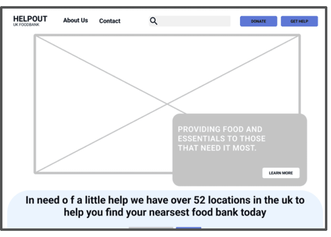
We create digital wireframes for each screen size. Here is an example of the desktop site, we made sure that the site looked visually consistent across the screen sizes and scaled up elements from the mobile site.
Creating Prototypes to test
Once we had created the wireframes for each screen we then used Figma to link each screen and create a low fidelity prototype that we could test with the users in a usability study
Each user was sent the link to the prototype and asked to complete the booking of a collection from a food bank
Mapping the user journey
We compiled a user journey map to get a good understanding of how the user would interact with the product.
Identify User Pain Points
4 OUT OF 1O users identified that it would be useful to have the option to select from a larger list of locations.
6 out of the 10 users identified that there was no easy way to navigate back to the home screen once a booking was confirmed
Some users felt unsure about adding personal information to the account creation form so adding a reminder that information is secure would be helpful
3 of the users said it would be useful to have quick select items to add to an order.
1
2
3
4
Sitemap
We created a sitemap to show the navigation flow of the site
Mockups of the Final Design
Mock ups showing the final look of the design
Creating High Fidelity Prototypes
Once we have created designs for all the screens we then used the prototype tool in Figma to add interactions this would allow us to create a working prototype to further test with the users
During the final round of user testing we identified various pain points in the design. Here is an example of one of these pain points.
4 out of the 10 users that tested the prototype identified that the goods section screen was slow and could be simplified with a list of goods. We decided to add options to select the most commonly ordered goods making the flow quicker and more efficient for the user
4 out of the 10 users that tested the prototype identified that the goods section screen was slow and could be simplified with a list of goods. We decided to add options to select the most commonly ordered goods making the flow quicker and more efficient for the user
High fidelity prototype user testing

BEFORE
AFTER
Final Steps
Once all the designs have been completed and specs have been added the design will be ready to had off to the developers
I will work closely with the developers to ensure a seamless build and help with any changes needed to the design
Once the site is launched we will then go back and look at how well the site is performing and use KPIs to determine any changes needed
Thanks for taking the time to read through the my case study.
For any information don’t hesitate to to contact me
joshwilkes.mail@gmail.com
For any information don’t hesitate to to contact me
joshwilkes.mail@gmail.com
W o r k
A B O U T